The Atlantic Maps Wikipedia’s Editors
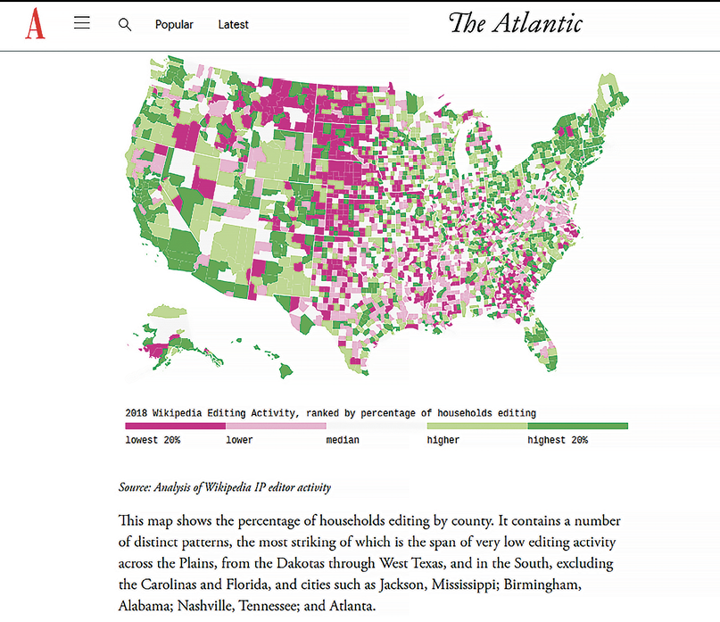
For a different take on digital maps, consider an article from The Atlantic. Michael Mandiberg went through 884 edits to the English-language Wikipedia and geolocated 43 million IP addresses, which he turned into a series of maps showing where those making the edits are—and aren’t—living (theatlantic.com/technology/archive/2020/02/where-wikipedias-editors-are-where-they-arent-and-why/605023).
 |
| The Atlantic published a map showing Wikipedia editing activity. |
If the maps generated merely discussed one datapoint, maybe they wouldn’t have been as effective. But Mandiberg used the maps as … well, a map. The article is built around his walking through each statistic—counting editors across the country by amount of contribution, religious adherence, population density, and average household income. The article is careful not to draw conclusions from the data-generated maps, instead coming up with interesting questions: Does population density affect the likelihood you’ll edit Wikipedia? Do Native Americans have low Wikipedia participation because of a lack of broadband access? What do income and religious adherence have to do with it?
The maps in this case are not answering questions but instead asking more. In a reference scenario, this would be annoying, but in the case of journalism, it plots out a route to more stories, or even more data to collect, with the idea of generating possible conclusions instead of more questions.
WATER EVERYWHERE, OR NOT
Maps by definition tell you more about the world around you. But what about the world you’re less likely to see? What about the infrastructure that provides the water you drink? Community Water Center developed a tool that provides information on California drinking water along with a set of maps that let users dive into how residents get their water—and how climate change might bring challenges in the form of drought.
Climate change means that what held true about the weather up until now is not going to hold true in the future. Precipitation will change. In places such as California, that means drought, and that might mean water scarcity. The Community Water Center (drinkingwatertool.communitywatercenter.org) is using maps to help Californians prepare for this via a mapping tool that lets them see where their water comes from as well as the state’s water supply in general.
You start by providing a California address—2000 Old Ranch Road, Los Angeles, for example. After having you confirm that the water supply comes to you via whatever method works in that community (in this case, a community water system), you get a map of information about the water supply in your area. Does your address have access to surface water or groundwater? Is there any Groundwater Sustainability Agency oversight? How is the water quality? Has the address’ water supplier had any Maximum Contaminant Level violations?
 |
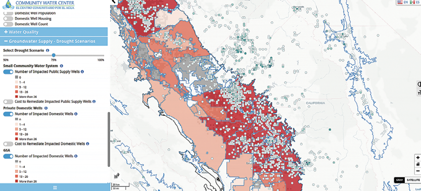
| The drought scenario in Southern California as mapped by the Community Water Center |
All this information is provided alongside explorable maps, so in addition to understanding the water infrastructure in one area, you can explore the offerings in another and see where your community comes out ahead—or lags behind. For a more macro view of California’s water situation, there’s also a larger tool that lets you model drought scenarios (among other things) and see how many of California’s public and private wells would be impacted.
Crowdsourcing the Lost Trails of England and Wales
Maps have generally been produced by a single person or a company with high standards for accuracy and quality. After all, if you’re out in the middle of nowhere, you want to make sure that the map you’re carrying doesn’t contain errors and or misrepresent the area.
Digital maps can be different. When gathering information, instead of providing critical guidance, it’s possible to open maps up and solicit information from lots of people. In fact, sometimes that’s the only way you can build up a solid dataset. U.K. walking group The Ramblers began a campaign of crowdsourcing to map 10,000 miles of trails thought to be missing from official maps of England and Wales. It was a spectacular success.
The Ramblers first launched Don’t Lose Your Way (dontloseyourway.ramblers.org.uk) in mid-February. They mapped England and Wales into 154,000 1-kilometer squares and invited participants to compare historical and current maps to find missing trails. Within 6 weeks, the job was finished: More than 3,200 people participated, with most, if not all, of the squares being checked twice.
At this writing the finalized map is not available, so the data is not entirely in about how many trails were found. But without crowdsourcing, it would have been difficult to completely check maps of England and Wales for missing trails, much less check them in 6 weeks. In this case, a big online crowdsourcing effort is going to lead to extra outdoor enjoyment for thousands of England and Wales hikers.
LAYERS OF LONDON MAPS
The Ramblers project was necessary because newer maps didn’t contain trails from older maps. Of course, paper maps can’t be updated on-the-fly, but digital maps can. Once you have a map platform in place, why not add new datasets? Why not create new layers? The British Library has been building a London map for years, and it just gets better and better.
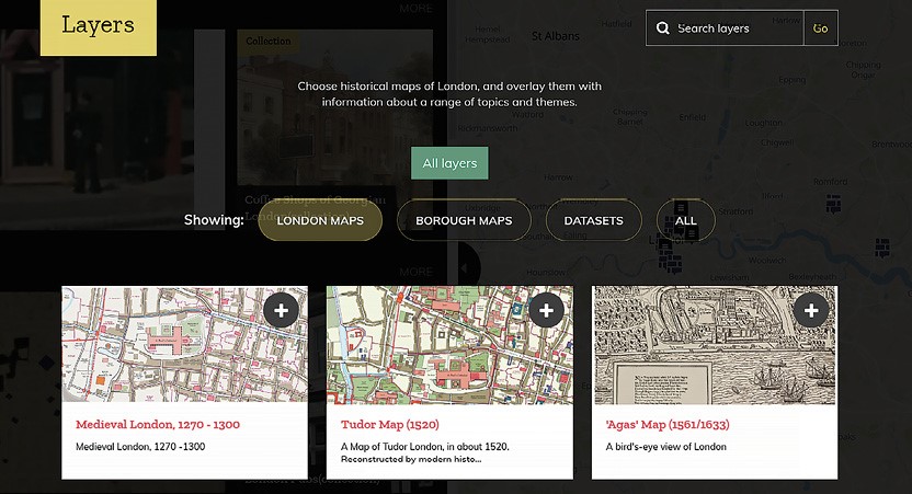
In 2016, the British Library launched a project to map London in multiple dimensions, partnering up with a number of institutions, including the London Metropolitan Archives, Historic England, The National Archives (U.K.), and the Museum of London Archaeology. Over the years, the project has turned into Layers of London (layersoflondon.org), a site that allows you to map London in several ways.
Want to see what London looked like in the past? A number of maps cover the 13th century to present-day. Want to see what bomb damage looked in WWII London? There’s a dataset for that. Interested in the environment, in transport networks, in fire stations? It’s all there!
 |
| The British Library’s Layers of London maps shows the history of the city. |
Often with online mapping, you’ll see distinctive maps for every type of information. There will be one map for natural features, another map for man-made features, another map for political boundaries, and so on. That’s useful for organizing information, but I think when it comes to accessing information, it prevents discovery. The Layers of London project admittedly has datasets with absolutely nothing in common, but if I take the time to explore it, I will end up with a more holistic understanding of London than if I visited discrete sites with distinct data types.
Asian Americans and Pacific Islander Americans in the U.S.
Maps tell you about the world around you. Maps like Layers of London can describe to you the present and the past. But some maps present information you may not have discovered otherwise. Maps can show you data that makes you go, “Huh. How about that.” Such is the case with a pair of resources from the University of California–Riverside (UCR).
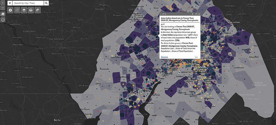
In 2019, UCR released a mapping tool (news.ucr.edu/articles/2020/01/31/aapi-data-releases-mapping-tool-asian-americans-and-pacific-islanders) that shows where Asian-Americans and Pacific Islanders are in the United States. UCR identifies those two racial groups as being the fastest-growing in the country, but according to the 2010 U.S. census they make up less than 6% of the population. Unless you live in specific areas of the country, you’re not going to look around and notice the change in demographics around you. But a map can bring demographic information to life and surface information you may not have been aware of.
 |
| The British Library’s Layers of London maps shows the history of the city. |
UCR’s Demographic Data & Policy Research on Asian Americans and Pacific Islanders mapping tool (AAIP Data; aapidata.com/censusmaps) provides information on the 20 largest metro areas of Asian Americans and Pacific Islander Americans in the U.S. (Each group has a separate list.) There are also maps with county-level data across the country. (The one for Pacific Island Americans is not quite finished.)
Once you’ve chosen a metro area, you can get tract-level information on the demographics of the area, the prevailing Asian American group, and its relation to other Asian Americans in the area and the population as a whole. The maps are color-coded so you can get a fair amount of information at a glance before viewing tracts. (The site also includes summary statistics for each metro area.)
This is a case in which the data about these two groups is easily available from the census. The problem is that it can be “drowned out” with information from larger groups. Mapping it out by making it visual makes it more immediate and more impactful.